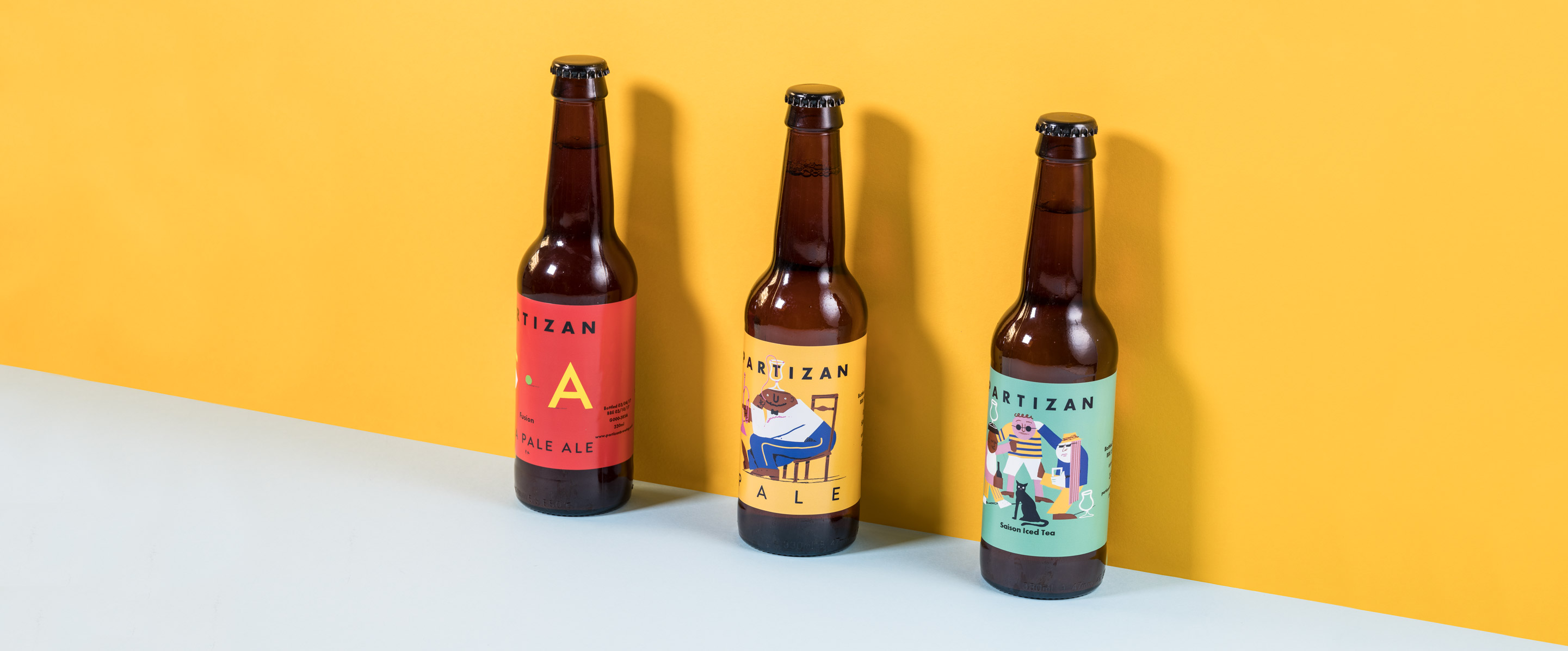
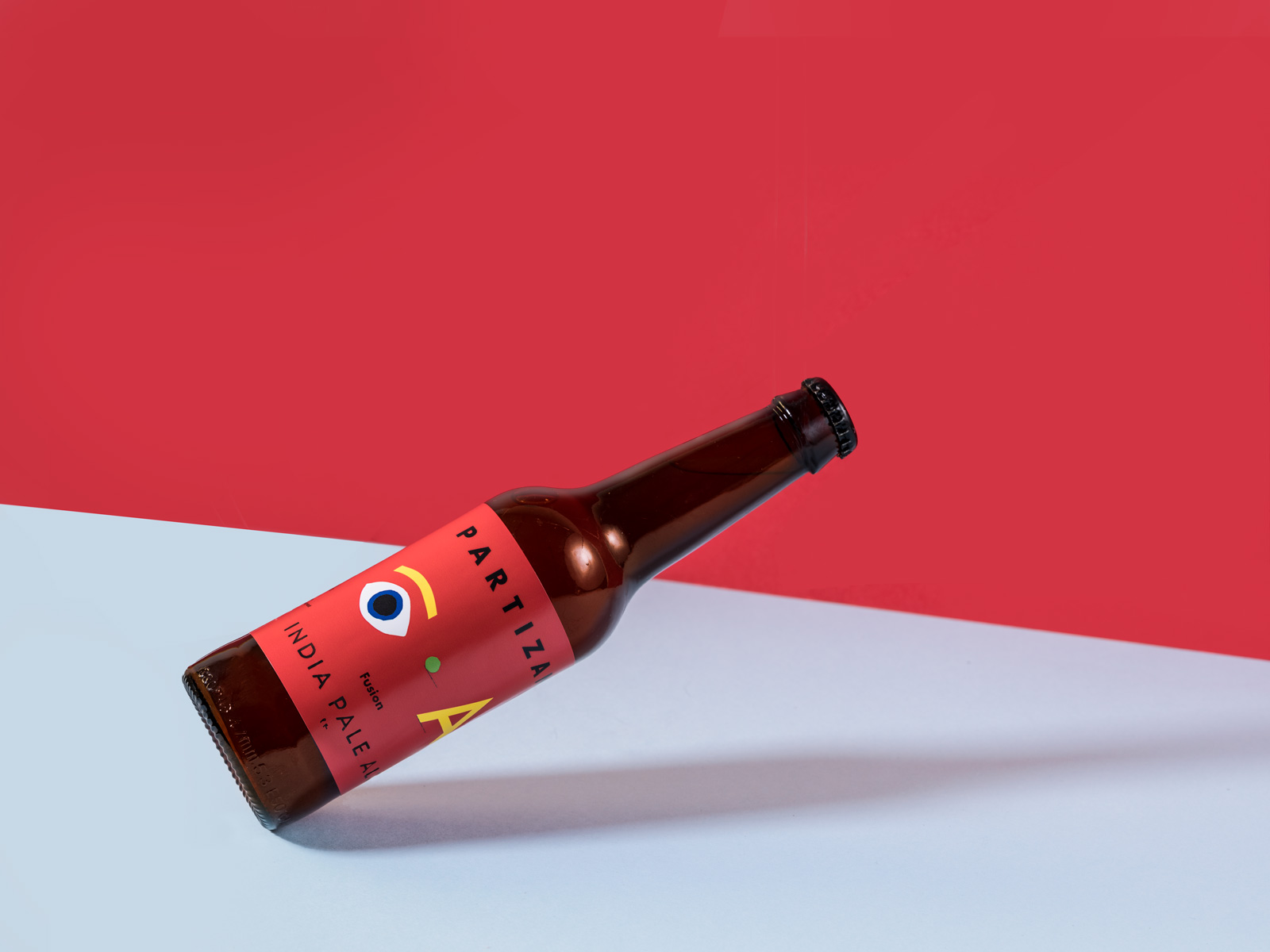
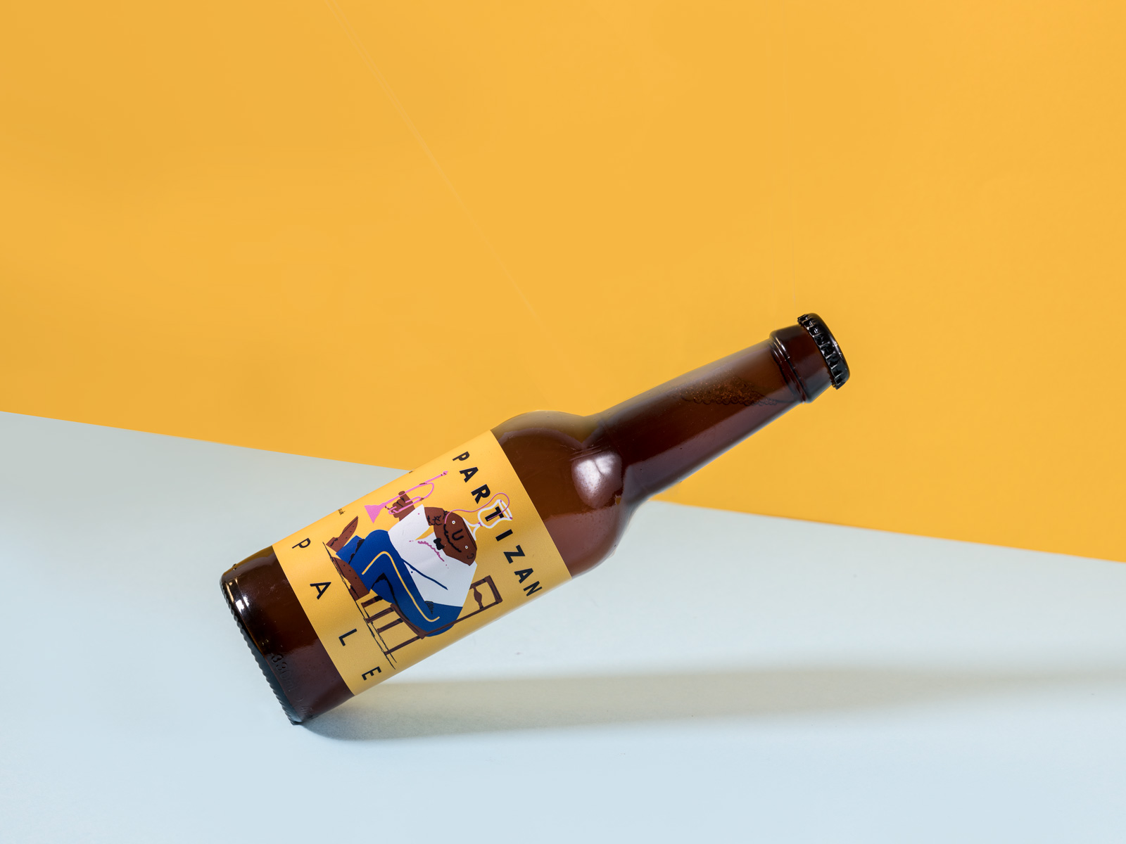
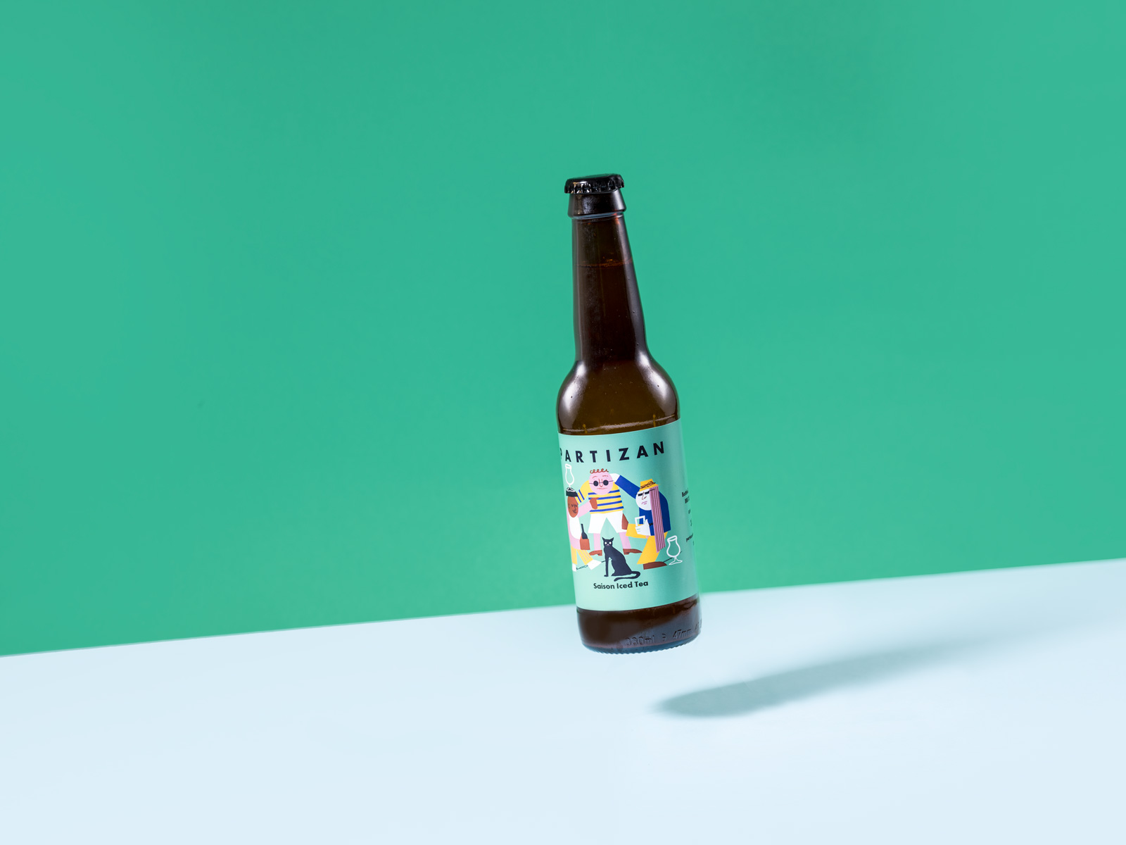
Partizan is a South Bermondsey micro brewery, formed in 2012 by Andy Smith. Initially brewing hoppy American beers that weren’t available fresh in the UK, Partizan are now known for their ever evolving recipes, and their equally inventive label designs. If you’re not familiar with Partizan but feel the labels faintly ring a bell, it’s probably because they were designed by one of our great Editions collaborators, Alec Doherty. Andy and Alec have kindly shared some insight with us into their brewing and design process…
ANDY
How much input do you have in the design of the labels? Or do you just leave Alec to it?
Usually just leave Al to it. I know what I’m good at and I know what he is good at. It’s incredibly rare I ask even for changes. I think it’s happened maybe 2-3 times in the 5 years we have been working together. We do meet up quite often and discuss “the brand” over a few beers so I think he just understands us as a company very well. In all honesty he’s helped shape our company a lot too so definitely doesn’t need any directing, it’s just a very natural partnership.
What sort of reaction have you had to your unique labels?
All very positive. There’s a fairly common thing we’ve had where people will tell us the illustrations remind them of something, like a book they had when they were a kid. If we don’t know the reference obviously the phone comes out and they start googling whatever it is. Quite often the pictures they pull up are actually nothing like Al’s. The pictures just seem to have this strange reminiscing trigger for people.
Why do you think Alec’s illustrations work so well with Partizan beer?
I think because Partizan is quite happy to change and wake up every day a new company we suit each other a lot. We’re both focused on challenging ourselves and evolving and getting better every day by trying new things and not being tied into a regimented aesthetic or ethos. It’s not quite anti-brand but a sort of brand apathy maybe? Neither of us are interested in creating something that is static and repeatable. We change our beer offering weekly to push ourselves to do better and also to engage people with something new, it’s really easy to disengage with an experience if you have been through it multiple times, so it really suits us perfectly that Al changes not only the labels but the style in which he puts the labels together, challenging himself and changing in the same way.
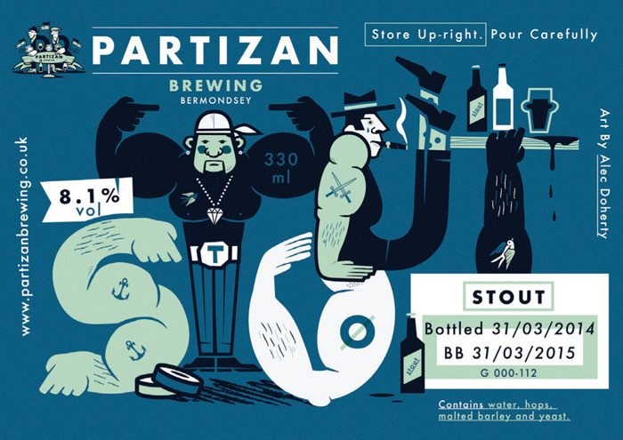
There’s some really nice detailed synergy that I doubt anyone’s even noticing too, like on the stout labels. We never really changed the stout recipe since day one as we really like it how it is. As a result, it’s the only label that doesn’t really change. Except it actually does, but just the hat of the guy who forms the T. I doubt anyone ever noticed his hat was changing… It actually got to the point where we’d just tell Al what we had been listening to and the hat would come from that. The R Kelly stout label is a personal favourite. 🙂
What’s your favourite out of the many fantastic label designs?
A tricky one. We were actually digging out some old recipes last week as we wanted to look at putting something new together for the end of summer based on something we had previously done. I don’t write the brewing logs myself anymore as the team has grown a bit now, but when I did I used to stick his labels on the backs of the fermentation records. We were flicking back through and looking at all the old labels as well and everyone was just like, ‘let’s brew that one again, the label’s so nice, I wanna get that label back on a bottle again’.
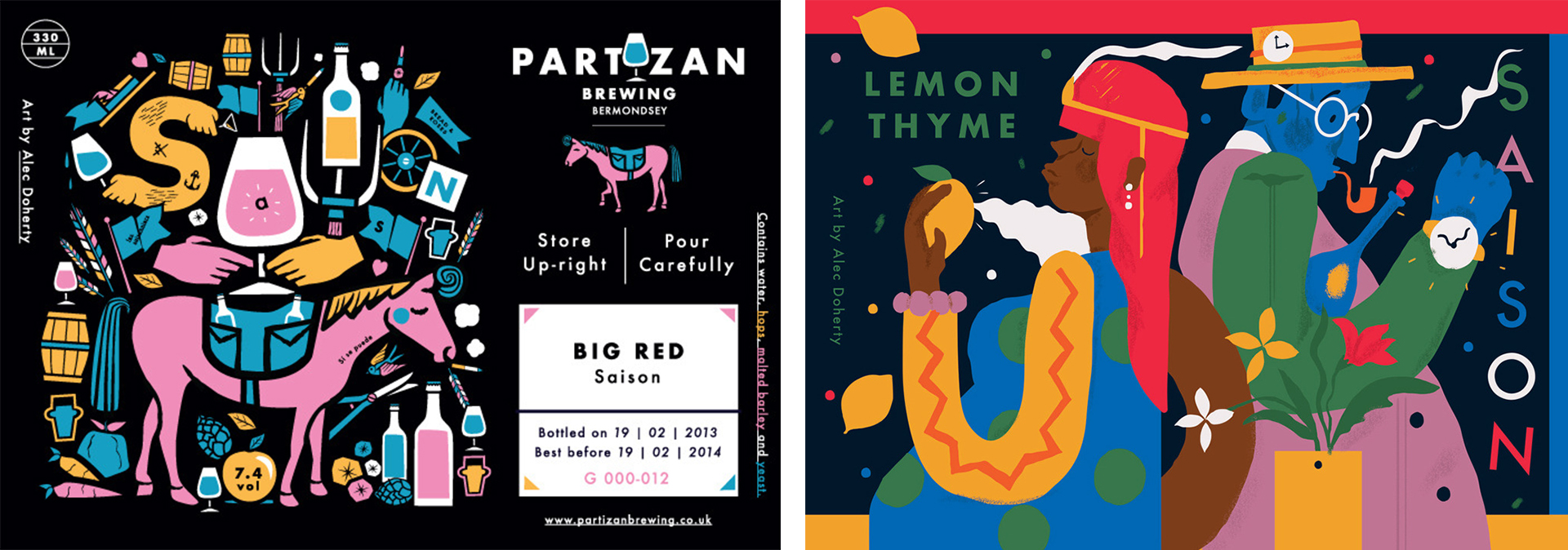
One that really stood out for me though was the Big Red Saison. It was just like these very electric colours on a black background with this pink horse that made it kind of look like neon lights somewhere in the dark, and it was at the time where Al would tell the story through building up lots of smaller detailed illustrations. I really liked that one. The recentish lemon and thyme one which was sort of again bold colours on black and quite surreal shapes defining characters and reminded me of what I think is a Miles Davis album cover that I’ve never been able to find (that memory trigger thing again) was a strong favourite too. The one he did with Keith Shore is a classic as well. Every time he sends the email through with the new artworks there’s a new favourite. Al knows I’m a big fan of the film Four Rooms with Tim Roth so did a rework on the Porter bottle based on that, that should be out very soon.
Are there any other breweries whose labels you admire?
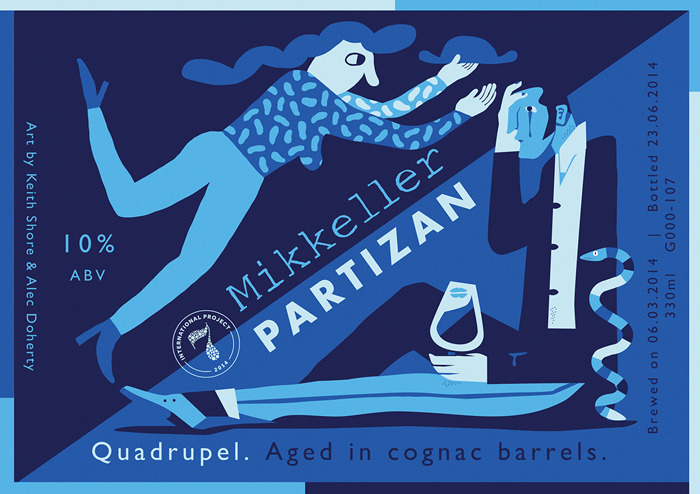
Loads yeah. So many in fact. Keith Shore who I’ve already mentioned is doing a great job for Mikkel. Omnipollo is basically a big art project, beer included, Karl Grandin is doing some crazy good stuff there. Nick continues to kill it at Beavertown, very much enjoyed the recent reload. You get this vibe from speaking to any of the team there, that it is a constant discussion and something they are all very mindful and proud of too. Another one where the art maybe has influenced the brewery a little even as well. Actually I quite like the very old school Beavertown labels that Jona (one of the brewers at the Kernel and amazing illustrator) used to do too, really nice detailed line drawings with a macabre sort of edge. Brasserie de la Senne always have super pretty stuff going on which really suits them and where they are from.The Flying Dog stuff is really great as well with Ralph Steadman of course and Pressure drops labels are always varied, thoughtful and pretty. Too many to mention really. As long as it’s not contrived and designy and trying too hard to look artisanal but stay safe and have mass appeal then I’m in, anything with personality I guess.
ALEC
How did you first get involved with Partizan?
Andy has been a good friend for years, he’s a Leeds boy and I met him when I was living up there. About 5 years ago when he was starting up the brewery he asked me to help him out with a little bit of artwork and we’ve been working together on it ever since.
Where do your ideas for the beer labels spark from? What is the process like?
I get ideas from all sorts of places, sometimes they’re inspired by the beer itself; the ingredients, the style or history of the beer. Other times it might be a significant date like a birthday or there’s been a new member of staff joining like the brewery cat Adina. I like to keep things interesting for myself and others so it’s a little all over the place.
Do you have any other favourite illustrated beer labels?
Yeah there’s loads of great beer art out there, my favourites at the moment would be Keith Shore’s work for Mikkeller and Jay Cover’s work with Camden Town.
What’s your favourite piece of work?
Partizan is my favourite bit of work. I like it because it’s very free. Beer bottle labels are kind of a similar to record labels – when I started out I wanted to design record sleeves – in that it’s a really simple format. The fact that it’s an indie brewery and run by mates also means I basically get to do whatever I want; sometimes for the worse and sometimes for the better.
If you want to see more of the Partizan labels, look no further than the Partizan Brewing Archive.