Meet the Makers – Selma Gulbahce

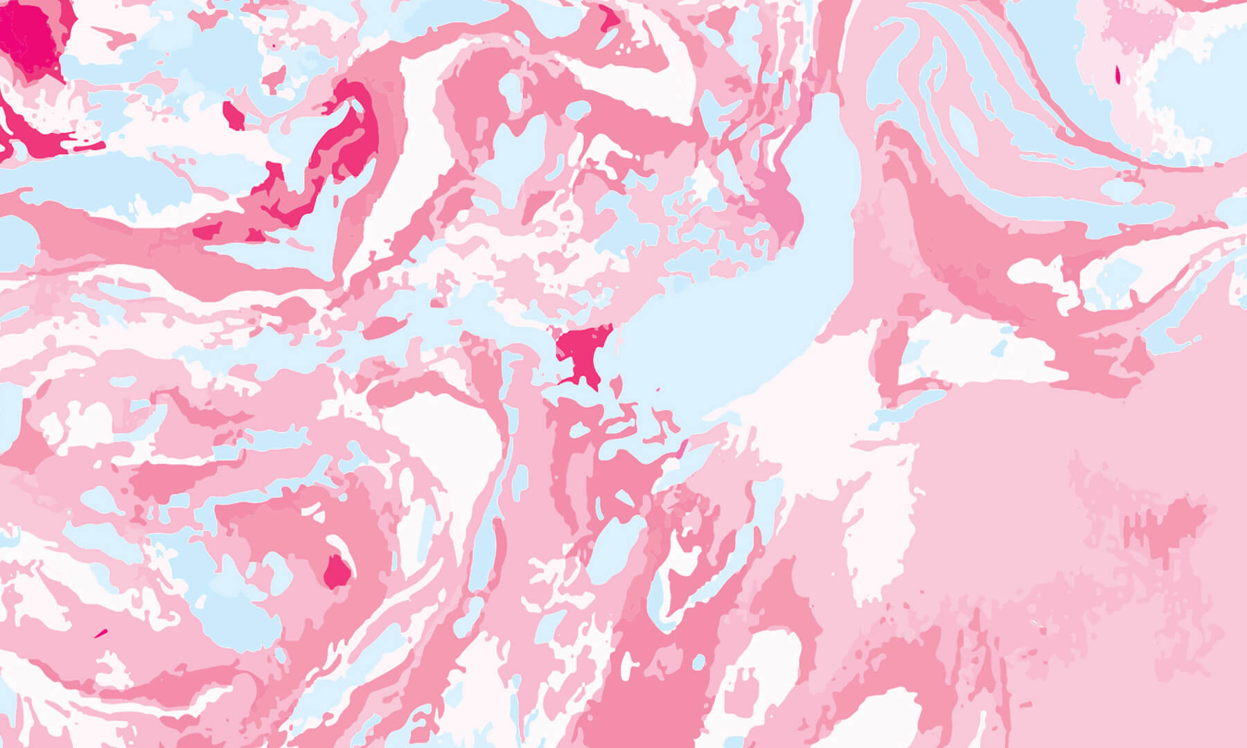
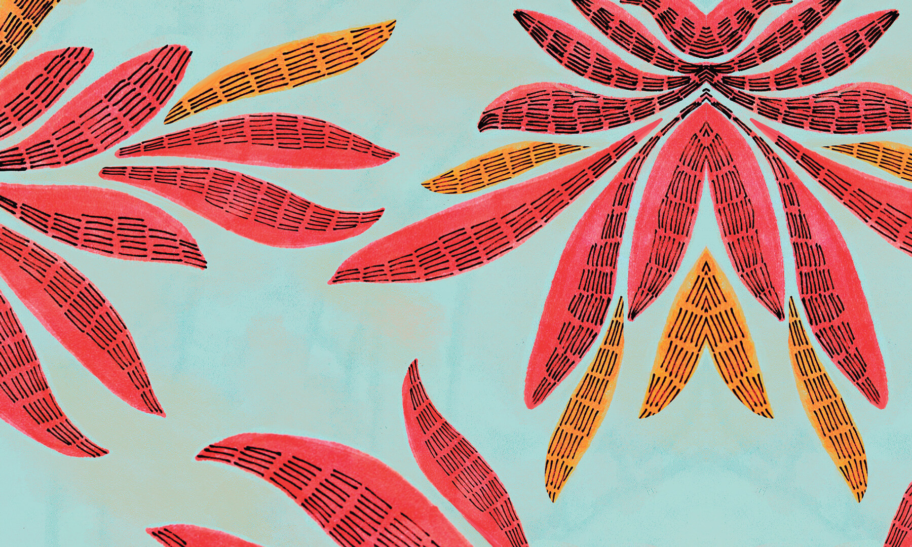
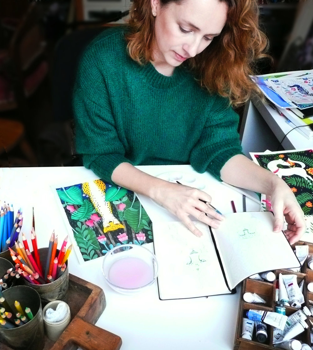
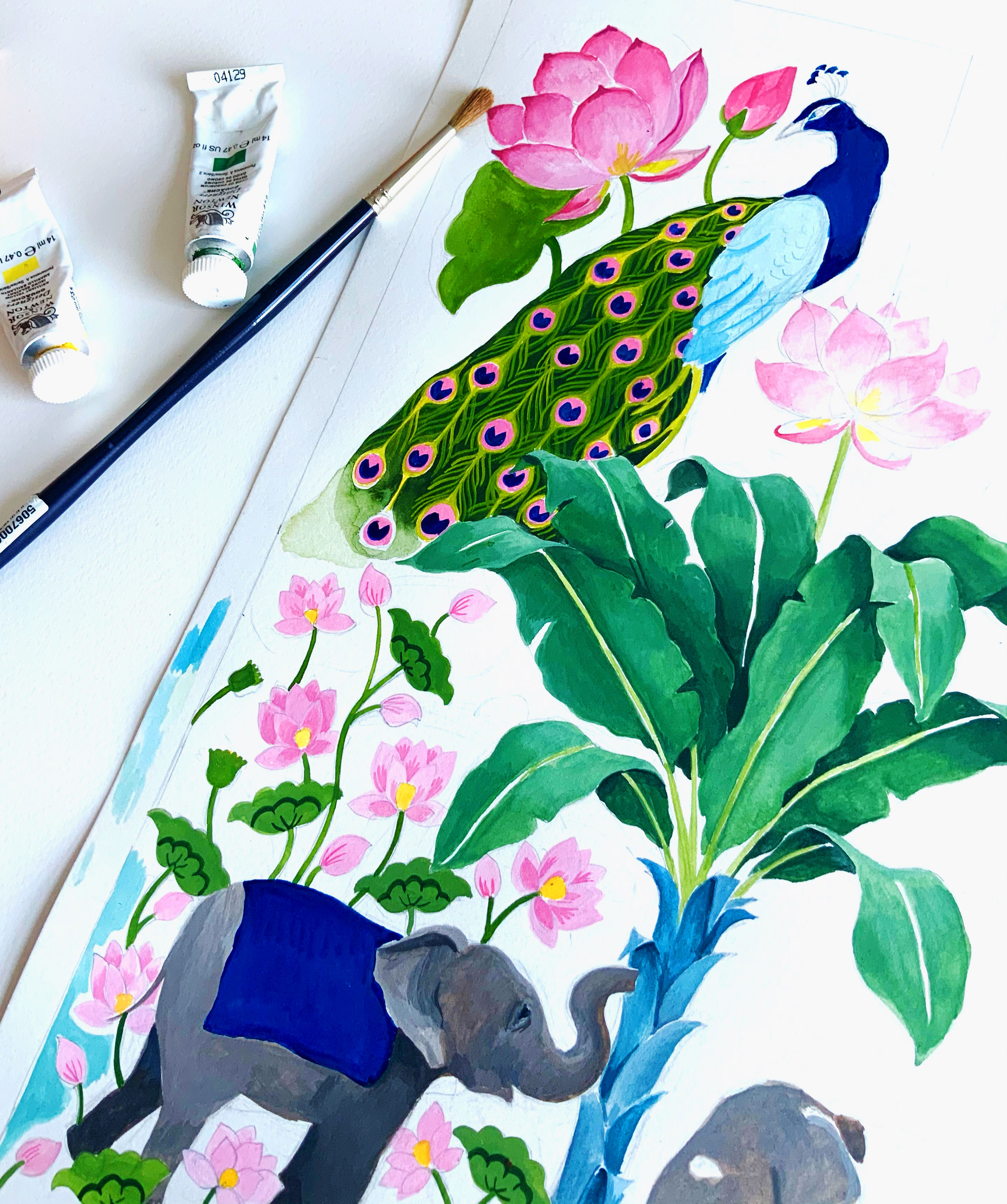
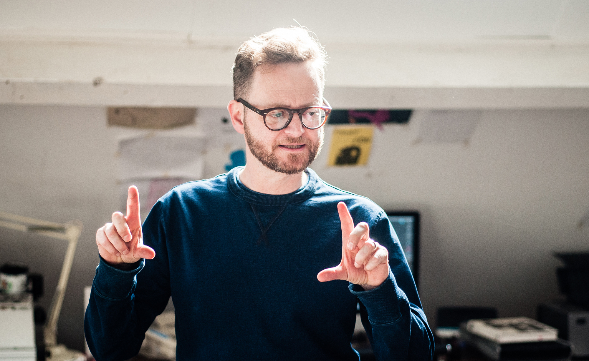
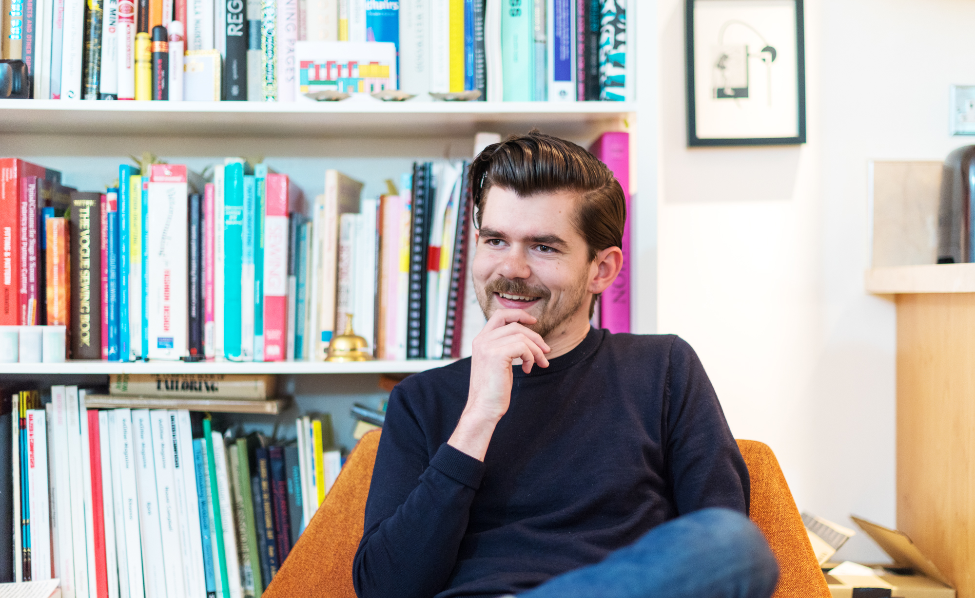
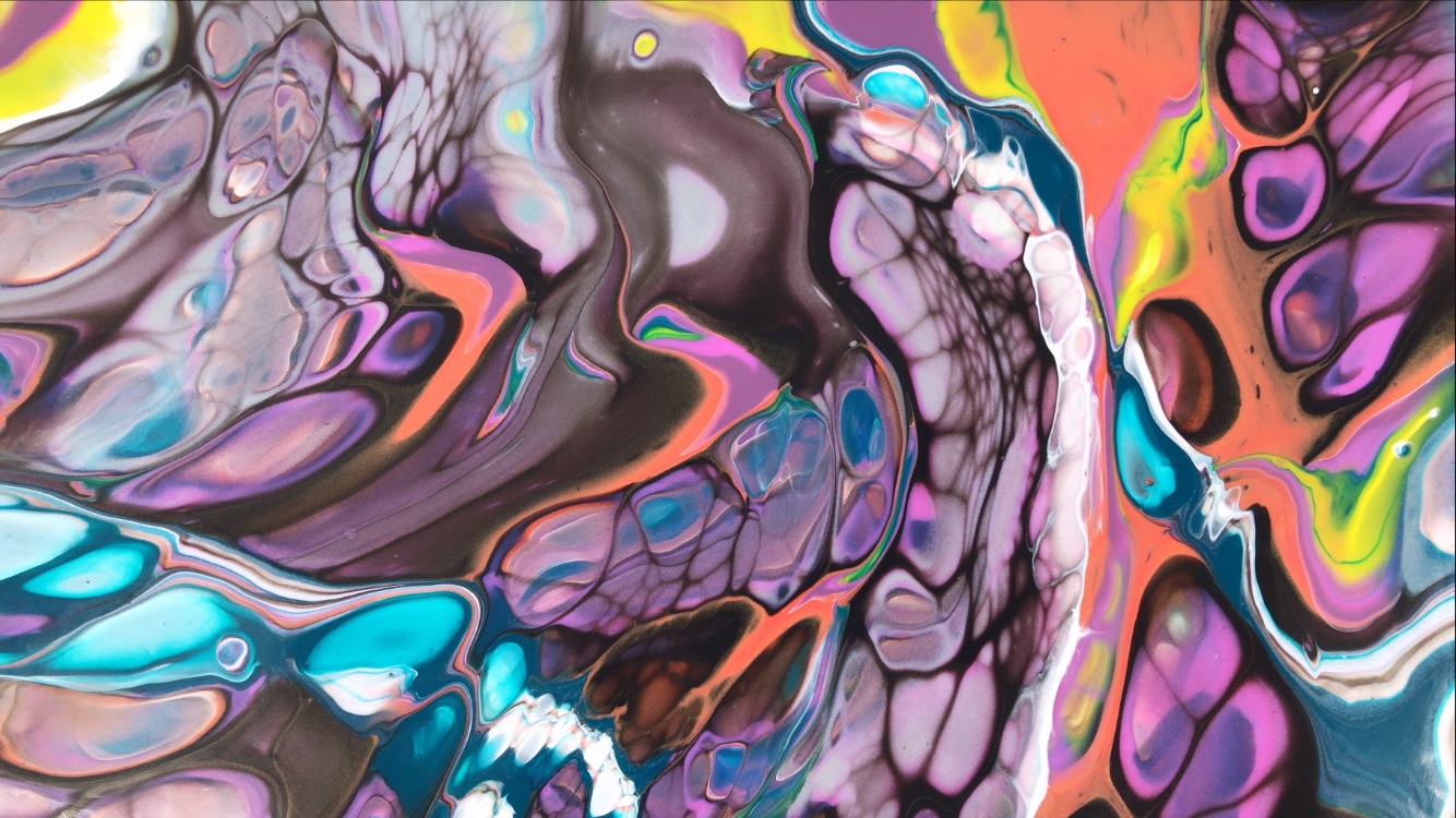
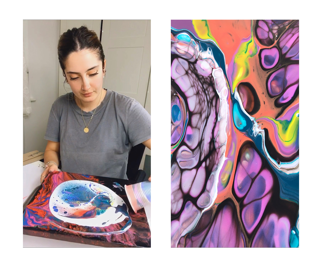
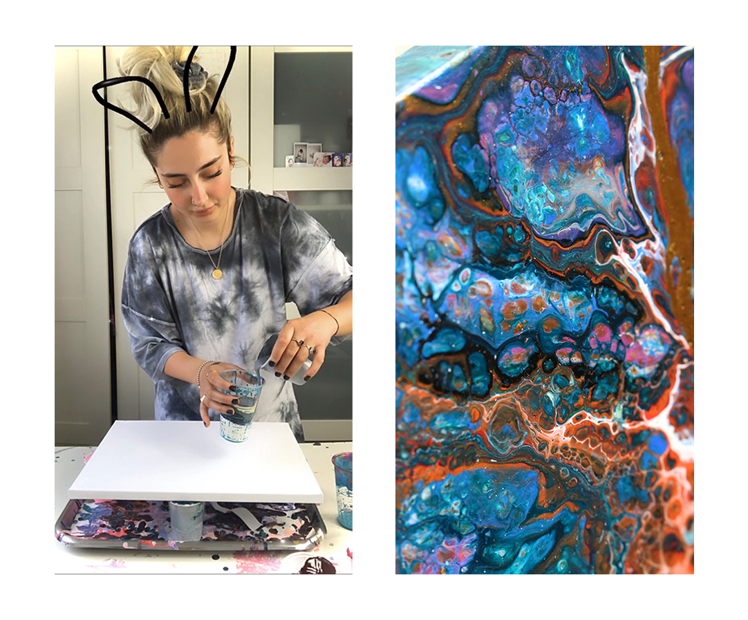
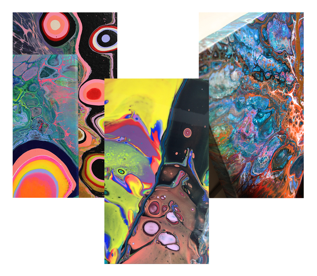
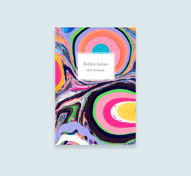
In this week’s Meet the Maker, we meet Selma Gulbahce. An abstract painter who produces beautiful and bold, fluid paintings using acrylic paints. Selma loves the freedom of never knowing exactly what she’s going to get when the paint hits the canvas, resulting in unique pieces every time. Selma’s love of exploring new techniques and hands-on work has helped shape the paintings she produces today.


Your work is very striking, with each piece being totally unique. When did you first start working within your chosen medium and how did that come about?

My journey began as an abstract artist in 2020 during the lockdown. However, I never really started producing any work for months. The reason for this was because I didn’t want to just dive into it, I wanted to gain as much knowledge as I possibly could. I was waiting for the right timing, but after procrastinating for months and months I realised the right time was never going to come, therefore I had to make it happen. 

Two platforms where I use as inspiration are Instagram and Pinterest! One day during lockdown I was scrolling on Instagram in my ‘saved’ posts, where I have saved thousands of inspirations. I came across an abstract painting I believe I must have saved from a year ago. I don’t know what it was about that abstract painting I saw, but I fell in love with it. I then started coming across more abstract work which then led me on to Sophie Tea Instagram page where I fell in love with her work. 

Photo of designer Selma Gulbahce creating a painting and one of her abstract fluid paintings.

How has your work developed over time and did you ever create work quite different to what you are producing at the moment?

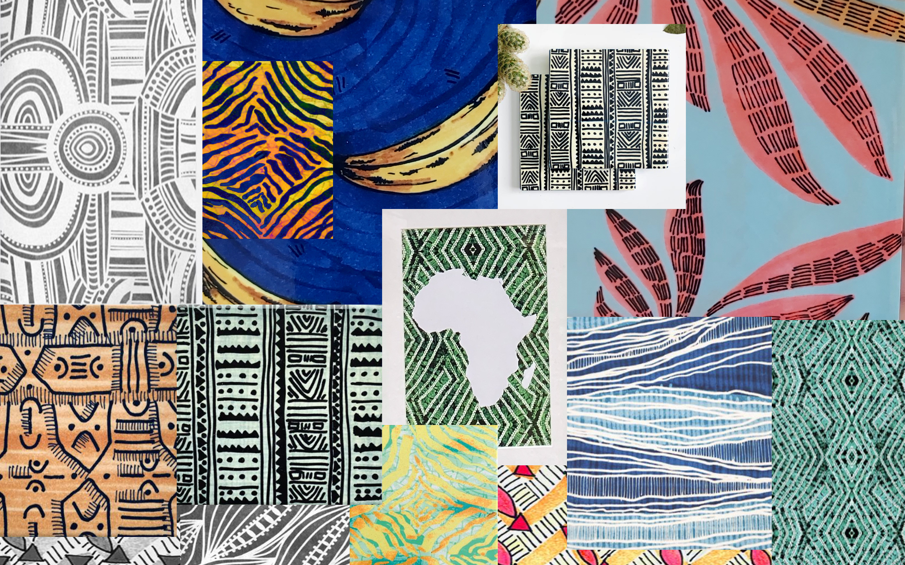
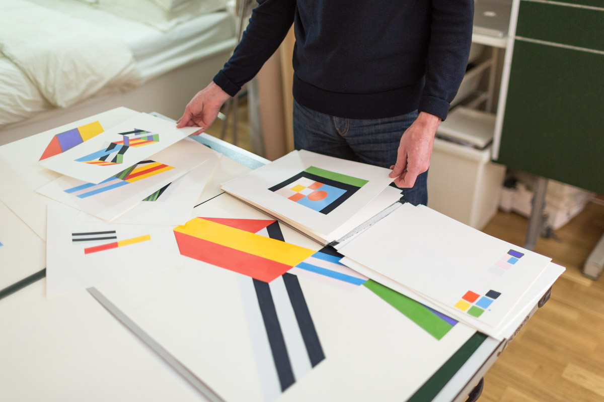
Yes, my work definitely has come a long way. I love exploring new techniques and styles therefore my work always evolves. However, comparing my work to 6 years ago I can definitely see a huge change in my process and development as an artist/designer. Even after researching current abstract artists and trends, I was still a little clueless. Therefore I began pouring and ended up producing random abstracts. I didn’t want to narrow my work down so I was using all sorts of colours and styles. Having said that, I still don’t have a style, I’m still freestyling. Abstract painting is always an anonymous one because you really don’t know what you’re going to get when the paint meets the canvas, and that’s really what I love about my work.

Photo of designer Selma Gulbahce creating a painting and image of one of her finished paintings.

Do you have a favourite artist, designer, or movement that has inspired your work/work ethic? (Can be a musician, performer, etc)

Three artists who inspire me are Polly Nor, Camille Walala and Sophie Tea. One day I was scrolling on Instagram where I came across Sophie Tea, and since then she’s been such a huge inspiration to me. In fact, she was the one that inspired me into abstract art. Over time she changed her style, she no longer produces abstract paintings she now paints the female body, emphasising body confidence and women empowerment. I literally can’t wait for the day I own one of her paintings! 

Three of Selma Gulbahce's abstract fluid paintings in bold colours.

Can you tell us a little bit about where you grew up and how that may have influenced your work? Did you study and if so did this influence the methods in which you work?

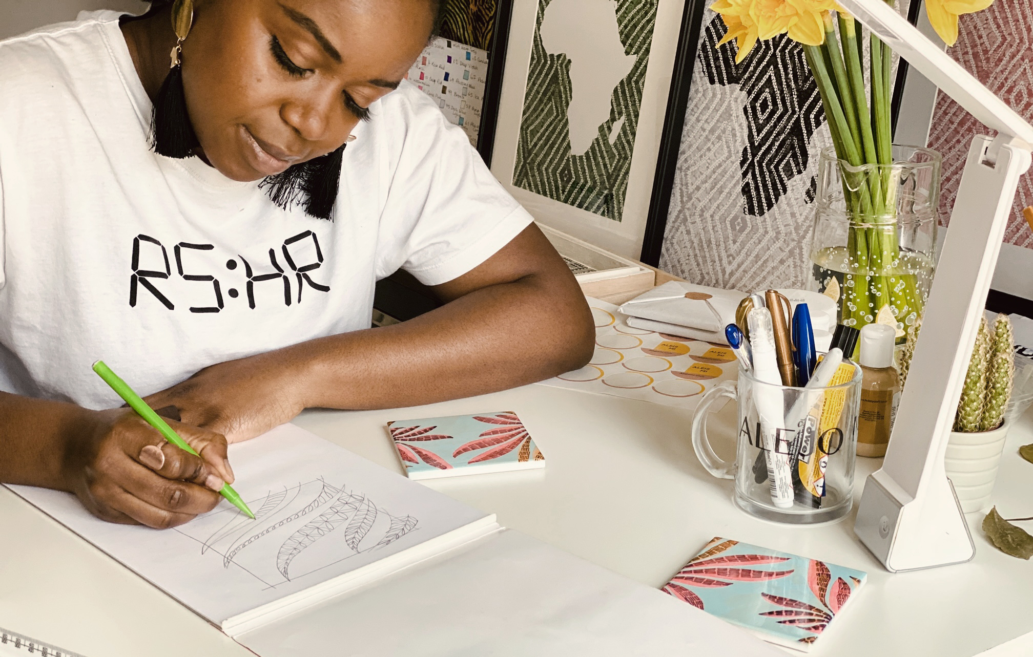
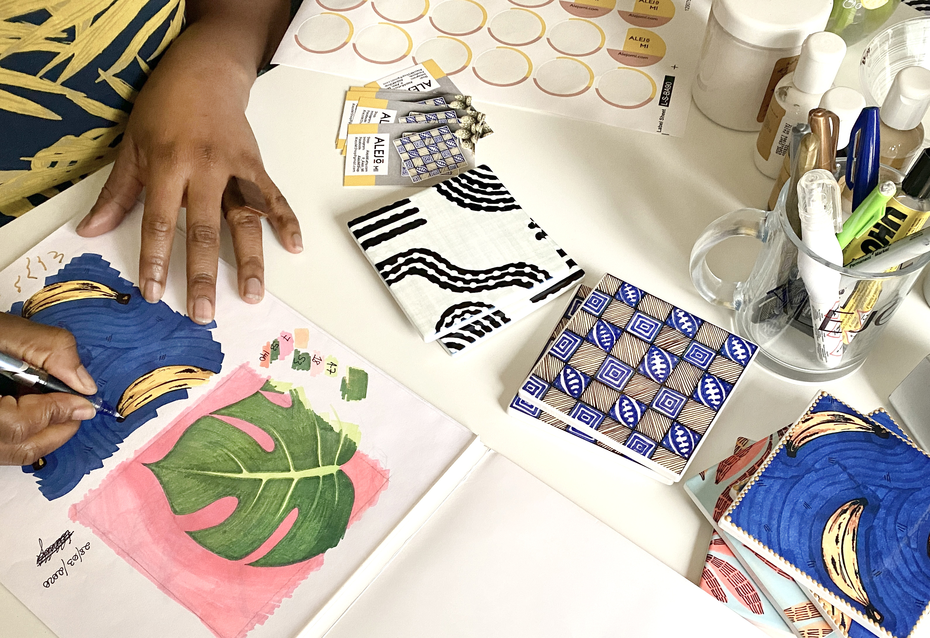
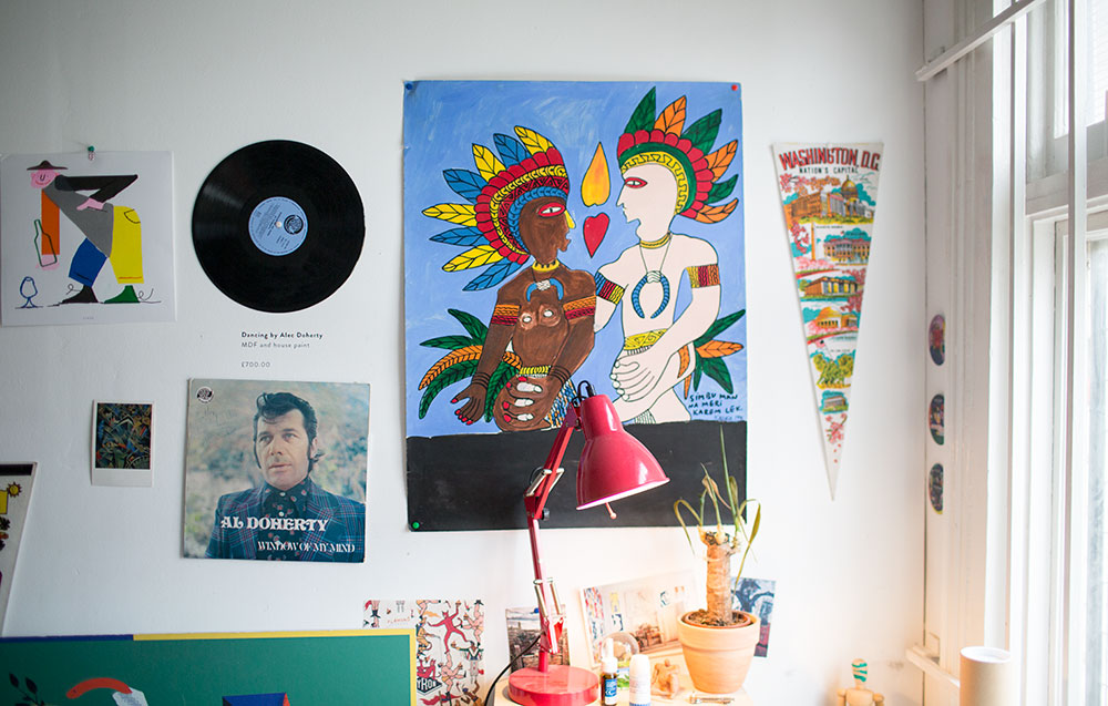
I was born into a middle eastern family, raised in south London. My elder sister and I were the only two artistic siblings in the family. We always inspire each other, but I can say she definitely played a huge part in helping me discover my creative side. I studied graphic design at Ravensbourne University and completed my master’s in Illustration & Visual Media at UAL. My master’s degree was a stepping stone for me as I was introduced to a wide range of mediums. At that point the world was my oyster, therefore I was producing work I thought I wasn’t capable of. Since I was so carried away producing work on my laptop, I had forgotten how much more fun it was and how comfortable I was producing hands-on work. And, this has massively reflected on the work I am currently producing.


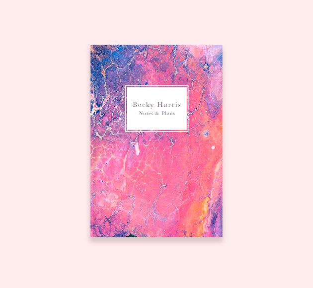
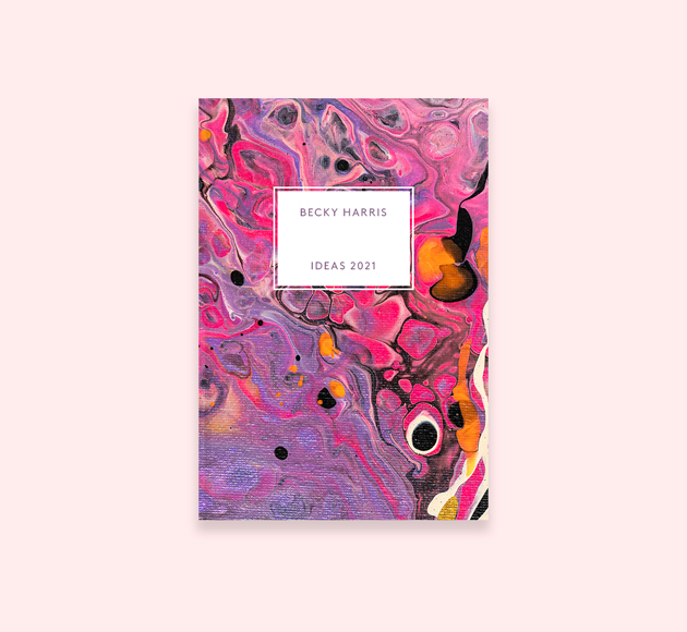
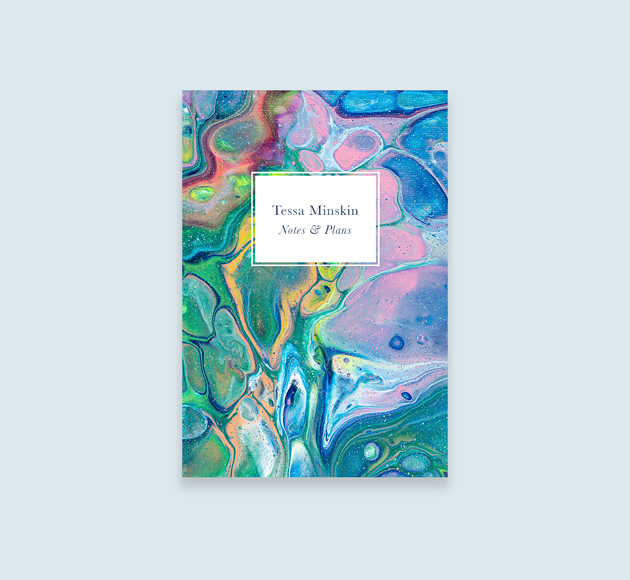
Browse Selma’s Personalised Designs

Iridescent Waves Notebook, designed by Selma Gulbahce

Meet The Makers – Olivia Brazier

To celebrate the launch of Forty Liquors’ Pornstar Martini cocktail, we travel behind the scenes to get to know the talented artist commissioned with creating the striking packaging design. Exploding with historic art references and snapshots that challenge ideas of voyeurism and the female gaze, the work of Olivia Brazier is as intelligent as it is creative and quirky. With cheek and charm both key characteristics of the iconic Pornstar Martini Cocktail, Olivia’s work fits the bill completely. Olivia’s use of collage really made an impact with us here at Bookblock. Going far beyond references from the online digital age, Olivia’s interest in the female nude and its representation throughout art history has a huge influence on her work. Empowering, seductive and commanding common themes of Olivia’s work parallel that of the Martini. Join us as we sit down with Olivia to get to know more about her as an artist, and her working process.

Can you tell us a little bit about where you grew up and how that may have influenced your work?

I grew up in the South of France in an area that is famous for its lemons and light. It used to be a really trendy place for artists such as Matisse and Jean-Cocteau to come and work so there’s a lot of art built  into the history of the region. There is a great deal of natural beauty too and an endless amount of colour. In the summer months a relaxed lifestyle takes over and many businesses shut for their holidays making it feel carefree. It is an appealing concept for life to be stripped back to the basics of eat, drink and be merry. This utopian idea is the underlying feeling I hope for my collages to encompass.

Do you have a favourite artist, designer or movement that has inspired your work/Direction?

The Italian Renaissance is really inspiring as this is a period when artists such as Raphael and Caravaggio were painting still lifes with visual puns and sexual symbolism imbedded into the fruits and vegetables. I love the idea of these super sexually-charged paintings being hung in ‘respectful’ locations under the disguise of being an innocent painting of a bowl of fruit.

I also draw a lot of inspiration from the female nude and its representation through-out art history. I am especially intrigued by the mythological genres painted by the Pre-Raphaelite brotherhood in the 19th century when nudity was a popular feature.

Has collage always been your main medium to work in or has your work developed over time?

I began working with collage about seven years ago. Before that I studied painting at university and by my final year I was building metal sculptures from layers of found metals. I’d like to say collage was a planned move but I fell into it (well, more like tripped into it!) and haven’t looked back since. I am drawn to the idea of being given something that already has its narrative and then manipulating it and morphing it into a new purpose.

When you begin a new project do you tend to create a detailed plan of what you want to do, or is your work process relatively experimental?

Each of my collages have three main components; the food, the human figure and the background. I pick one of these to begin with and then try to combine it in with a second component. Once I have a good fit I then seek out the third component. It is an elimination game as I can only work with what has already been printed. I source these from a bunch of different books and magazines ranging from cook books, gardening manuals to vintage and interior design magazines.

Forty Liquors’ Pornstar Martini

Created in 2002, the Pornstar Martini has become the UK’s favourite cocktail. This Forty Liquors twist is delicate whilst maintaining all the associated sauciness. The ingredients are as follows; Passionfruit, Vanilla Vodka, Passoa, Pineapple Rum, Verjus, Champagne cordial, and Citric Acid. With layers of sophistication and handfuls of fun, the Pornstar Martini is a staple of any good cocktail soirée. To that, we say chin chin!

Meet the Makers – Tom Ashlee

For today’s meet the maker, we meet Tom Ashlee. Tom is a Kent based Graphic designer and Illustrator working across a variety of platforms and mediums, from package design to lyric videos. Seamlessly moving from bold and striking logo design work within the music industry to calming, detailed pattern work for local brands, Tom’s love of album artwork consistently inspires his working approach. With sleek finishes Tom’s attention to detail instantly makes an impact, as complex compositions meet to present retro themes among an ordered creativity.

Can you tell us a little bit about where you grew up and how that may have influenced your work?

From a young age I had always been interested in music and owning the CD of a new favourite song or album. I believe this is where my initial love for design and also music came together. I began creating doodle-esque drawings which I later developed into stronger pattern compositions and I continue to develop this style, whilst also experimenting in other areas of design.

Do you have a favourite artist or designer that has inspired your work?

In school I found out about multidisciplinary designer Kate Moross, who also primarily worked in combining design and music. Their work always inspired me, not just from the work they create but also their continuous drive and forward thinking within the industry.

Your work focuses on pattern design but can be varied in style. Do you have a preferred medium to work in or enjoy experimenting with a variety of different mediums and styles?

I would say I enjoy a good balance of working with pen and paper but also taking things into digital media, working with drawing apps such as Procreate and also Photoshop. In terms of my style, I have always loved quite abstract art and design, admiring the work of artists such as Kandinsky and more contemporary artists like Gareth Pugh. I enjoy developing my style, playing with shapes and patterns in all different ways.

When you start a project do you tend to start with sketches or work digitally?

If I am working with pen on paper I tend to sketch out a rough idea of a composition I like and then go over with pen to create the finished product. If I am working digitally I tend to start with a rough concept of what I want to do and experiment with the composition until it feels right.

As a part of our Stationery Week campaign we are offering a generous 50% discount on selected makers and their designs for one day only! Today we are offering 50% Off Tom Ashlee personalised stationery using code: TOM50ASHLEE


Meet the Makers – Astrid Weguelin

For today’s instalment of Meet the Makers, we go in depth with one of our closest collaborators. A mainstay in Bookblock’s creative process, illustrator Astrid Weguelin brings joy and serenity to the forefront of her work with every design. Bringing us a new special Art Therapy Journal this Stationery Week, we wanted to understand why this particular focus was so important to Astrid, and how its fruition into reality was different compared to the creation of previous works.

Beginning with an interest in art therapy as a concept, Astrid was inspired by its ability to be a form of both relaxation and expression. As so many creatives can find, balancing the want and need to be creative with other life pressures and emotions can very difficult, often with creativity stopping completely. Through researching theories and online accounts, Astrid was able to take on her own approach to the project. Through exploring the different drawing exercises used in global art therapy sessions, Astrid realised she wanted to make this journal more like a creative diary. With fun and freedom being key attributes of creativity, Astrid knew she wanted to include the chance to experiment with different mediums as much as possible, as well as documenting your experiences in ways other than writing.

On explaining the process she went through when researching and collating ideas, Astrid notes “I’d think about what I do when I’m stuck for ideas – I get a few different materials and just doodle until something interesting catches my eye that I can develop further. Equally when I’m stressed, I like to draw to take my mind off whatever I’m thinking about – so I wanted to create drawing exercises which meant you could focus on something creatively for a while and help to relax. The exercises are there to give guidance on where to start, but also leave enough space for you to create freely.”

On a mission to know more, we continued to talk shop with Astrid, learning about her childhood, her biggest inspirations and  how she developed her signature style.

Can you tell us a little bit about where you grew up and how that may have influenced your work?

I grew up in north London, I don’t think that particularly influenced my work that much. I’ve always loved architecture and big concrete buildings, which maybe started an interest in shapes and collage. But I love finding the beautiful patterns and shapes within simple things – like vegetables! Food and nature are a big influence on my work and are what I always turn to when I’m stuck for things to draw. 

Your work is full of texture and abstract takes on objects or shapes. Has this always been your signature style or has it been something that has developed over time?

I started working in this way in my second year of university, I used to work more in paint and watercolour. We were introduced to traditional printing, like mono-print & lino-print, where you roll out the ink and use stencils. Once I had started to collage shapes together and get to create fun textures it felt a lot more natural to work in that way and I haven’t turned back since!
It has definitely developed a lot since then, as I now work more digitally rather than hand-making my collages. But I do switch it around sometimes – between working more detailed to pulling it right back to working with the basic shapes of objects. 

When you start a project do you tend to start with sketches or work digitally?

I do a very a few very rough sketches, to map out different composition ideas and try out colour combinations. I then do a digital sketch on my iPad which is more finished in terms of colours I want to use. I then primarily use Photoshop, using a combination of brushes and hand-made ink textures which I’ve scanned in, to cut out shapes and patterns. I prefer the ink textures to brushes as they are filled with lovely irregularities where the ink has built up, giving more of a natural, organic feel to my work. 

Do you have a favourite artist or designer that has inspired your work? 

Henri Matisse! I’d always loved his work; I remember going to an exhibition of his cut-outs at the Tate while I was at Uni, and that having a big influence on my work. Seeing them in person was amazing; the bold, simple shapes full of life. I often look back at his work when I feel a piece I’m working on is getting too busy – as sometimes simple is best!


Browse Astrid’s Personalised Designs


Meet the Makers – Type & Story

For another instalment of Meet the Makers, we sit down with Type & Story a small but exciting London design studio making contemporary paper products. Founded by Niccy Iseman with the minded approach of living well and with purpose, conscious intent is at the core of every story choice and the brand’s ethos overall. Promising to bring balance to your life through confident designs, Type & Story bring an elegance to organisation. Operating like a micro fashion house in that each story is different but always under the umbrella of typography and storytelling, each product is designed to uplift, inspire and empower.

Addressing their origins and interests, Type & Story note “We take interest in so much. We take nothing as fact and are open to multiple interpretations. We take interest in how things are displayed and styled as well as what the core of each collection means. We are open-minded and revel in the act of storytelling.”

Can you tell us a little bit about where you grew up and how that may have influenced your work?

I studied Art History for my degree which definitely helped conceptualise the visual world and where I sit in it as a graphic designer. I grew up in London and worked part time throughout my teenage years at retailers such as Selfridges, Liberty and Harrods which exposed me to the most design led commercial products on the market. This undoubtedly helped shape my taste, level and passion for gifting products.

Your work varies from graphic notebook designs to more illustrative card designs. Do you enjoy experimenting with different styles and compositions?

Yes. For as long as I can remember I’ve told myself the narrative that I can’t draw. A few years ago I invested in an iPad and started to explore the application  Procreate which changed the way I design. I realised that maybe I can draw. I don’t like being pinned down to one style, I like to evolve and flow with the mood of the time.

When you start a project do you tend to start with sketches or work digitally?

I always create a moodboard before I start designing which incorporates competitors, colours, themes, styles, and genres. It can be anything from a single page to a 50 page document!

Do you have a favourite artist, designer or movement that has inspired your work/work ethic?

I am inspired by so much. Mostly my own feelings and things that you can’t see. But if I had to narrow it down, my favourite artist is Tracey Emin. I love how she prioritises the concept over the aesthetic. Her approach is so witty and honest its refreshing. Music also helps me create. I designed the entire Planet Earth Collection in three mornings whilst listening to the band Life in Film (who are no longer together anymore!)

Meet the Makers – Alejo Mi

For this Meet the Makers we meet Alejo Mi. Tumi, the creative mind behind the brand, describes its style as ‘afro boho chic’ and we couldn’t agree more! With uplifting colours and conceptual compositions, it’s clear Tumi’s Nigerian heritage encompasses the identity of the brand, even though Tumi left Nigeria for England aged just 7. Meaning ‘My Guest’ in Yoruba, Tumi’s native mother tongue, Alejo Mi stands to represent the help yourself spirit. With lots of things to decorate and enhance the beauty of your home, Tumi’s purpose with Alejo Mi is to provide. From coasters to wall prints, Alejo Mi creates a cohesive aesthetic transporting you to her mother land. With such an important contextual history and heritage behind the brand, we sat down with this maker to learn more about how identity impacts product.

Can you tell us a bit about where you grew up and how that may have influenced your work?

I was born in Nigeria and lived there until I was 7 when my family moved to West Yorkshire. What a culture shock! From the sub-Saharan heat to seeing snow for the first time. My art allows me to revisit my memories of Nigeria and allows me to marry with that with other African indigenous patterns and motifs. Every now and then I also like to mix other shapes based on how playful I’m feeling at the time. My work is always a mix of all of these things.

Can you share any notebooks or sketches with us to show an insight into where some of your projects began?

Yes, I prefer to draw on loose sheets of paper. I find that I reserve a sort of reverence for sketchbooks, which I almost treat as sacred spaces. Not every sketch will make it into a sketchbook unless I really love it. Below, I have a selection of different sketches and how they start. My love for the widely enjoyed African delicacy of fried plantain (a banana-like fruit that is eaten cooked) is celebrated in my earlier prints. I did several iterations of the print and after much manipulation I was happy with it and titled it ‘Plantains on Blue’.

How do you typically start a project? Do you tend to begin with rough sketches or do you prefer to start digitally?

Every Alejo Mi print starts its life as a pencil and paper sketch. Once I am happy with the sketch I add colour using paints or watercolour markers. I have started experimenting more with digital art, but I follow the same process, by starting off with a real life sketch. I love to work on all sorts of different mediums, but watercolours have my heart. I find I have greater control and precision with these tools which allows me to feel better connected to what I am drawing or sketching.

Do you have a favourite artist or designer that has inspired your work?

When I was younger, I really loved the work of Henri Matisse for the vibrancy and the boldness within his works. Then shortly before I started my Architectural studies at university, I fell in love with the work of Antoni Gaudi. I have always had an affinity for artists who challenge this idea of acceptability and those who do so with bold colours and vibrant shapes. Fast-forward to today, I am currently inspired by an eclectic mix of visual and audible art. I read Half of a Yellow Sun by Chimamanda Ngozi Adichie in the summer of 2010 and was greatly inspired by the stories which brought up my memories from my earlier childhood and brought to the forefront my desire to express cultural art that relates to my own earlier influences growing up in Nigeria.

Where do you see your art going in the next couple of years?

I would love to see my art in more homes. I would love to see my art prints gifted to friends, my coasters on the desks doing their bit to brighten the work space. To do this, I would love to partner with more brands and boutique shops to release more home décor and giftable items.

Browse some of Alejo Mi’s designs

Meet the Makers – Bex Parkin

This week for a Meet the Makers feature, we meet Bex Parkin. Packed with colour and enchantment, Bex Parkin’s delicate hand-painted designs celebrate the joy and wonder of nature. With pink tigers and giant kaleidoscopic jungle leaves, Bex invites us to the surreal side of the wild. Beautifully intricate, using print, colour and pattern, Bex finds inspiration everywhere, from Persian rugs to Indian textiles. With environment being an important constant in Bex’s life, it’s not surprising that she’s based with her family ‘on a hilltop somewhere in rural Staffordshire’ as she herself describes. Expressing that this scenic dreamland is where she is happiest, it’s clear imagination and fun are key themes across all of Bex’s designs. We recently sat down with Bex to learn more about her life, her inspirations and her working processes.

Can you tell us a little bit about where you grew up and how that may have influenced your work?

I wouldn’t say where I grew up has had any influence on my work but I’ve had a fairly nomadic life so far and haven’t really settled in one place for very long. I’ve lived in London, Staffordshire, Florence and Shropshire to name a few but I’ve done a fair bit of travelling too. Ideally I’d love to live in a cabin in the mountains and create big paintings of animals and jungles all day!

Your work tends to focus on nature and animals. Has this always been your area of focus or was this something that developed over time?

I have always been drawn to nature as a subject matter as this is where I’m the happiest – when I’m not working, I’m hiking or trail running. When I first started illustrating a few years ago I was desperately looking for my ‘style’ but really the best way to find it is to paint those subjects you enjoy the most. The first leopard I painted was a challenge I’d set myself to see if I could do it – it’s one thing to paint it but another to capture a mood or character.

When you start a project do you tend to start with sketches or work digitally?

For me, the process always starts in my black A5 sketchbooks with an HB pencil. I’ve amassed quite a collection now and they’re great to look back on for ideas. Then the design is drawn out onto Langton hot pressed art paper and painted with gouache. The final stage is tidying up and tweaking using Procreate on my iPad. If I’m doing a repeat pattern I sometimes then turn to Photoshop on my PC.

Do you have a favourite artist or designer that has inspired your work?

There are hundreds of artists and designers that I’m drawn to. I find inspiration in a whole range of designers and work, and have a nice collection of reference books to pour over. It can be Persian rugs, Indian textiles, Victorian patterns, vintage botanical prints – I find ideas everywhere. I recently found the large scale floral work of Sarah Graham – amazing!

Browse some of Bex’s personalised stationery designs

Meet the Maker – Paul Blow

We’re super excited that Bookblock Editions’ latest collaboration is with Dorset based illustrator Paul Blow. You’ll definitely have seen his work before, either on TFL posters on the underground or gracing the pages of The Guardian, if not in a myriad of other publications, restaurants and websites. Graduating from Maidstone College of Art in 1992, and continuing on to complete an MA in Narrative Illustration in 1994, Paul has over 18 years of experience working as an illustrator.

Paul’s designs are full of charm and wit, creating a sense of narrative that pulls us deep into private worlds through mysterious characters, mesmerising landscapes or both. He cites his influences as David Shrigley, James Turrell and Erik Kessels, and this makes perfect sense when you look at the combination of intriguing humour, dramatic light and often small but poignant human elements. Colour is also key in all of Paul’s designs, the selective choice of hues only adding to the mysterious atmosphere.

Paul’s 4 Bookblock Editions notebook designs are available now in the shop, editions.bookblock.com, for £15 a piece. A perfect way to add some mystery to your everyday.


London Illustration Fair Competition Winners

At the London Illustration Fair, we ran a competition for aspiring illustrators, designers and creatives to have their artwork chosen as the cover design on a limited edition notebook, to be sold on the Bookblock Editions website. We were inundated with incredible artworks, both internationally and closer to home. Some familiar Editions faces, Claudine O’Sullivan, Rob Flowers and Marylou Faure, had the hard task of choosing the winners – and they certainly selected some illustrated treats.

Sophia Ward was our winner with a quirky, stand out artwork which has beautifully translated to an Editions notebook. Originally from Brighton, Sophia is a London based freelance illustrator and a recent graduate of Illustration and Animation from Kingston University. Sophia’s style is playful and vibrant. She owns the humble pen, layering colours and line with a painterly feel. Sophia’s sketchbooks reveal an intimate observational drawing approach, layering expression, form and shape with a clear influence from the tactility of printmaking.

Website: https://www.sophia-ward.co.uk/

Insta: @sophiawardillustration

Hattie Clark is a freelance illustrator based in Leeds who graduated in 2016 with a BA (Hons) in Graphic Communication from Bath School of Art and Design. She was selected as 1 of 15 Art and Design Graduates for Creative Review’s Talent spotting initiative where her work appeared on over 1000 JCDecaux digital screens across the country. We’re really drawn to her use of characters in her work which are expressive and individual. Her drawings really translate to her fun, hand crafted ceramic works, which we’d love to have in the Bookblock office! Hattie told us: ‘I love to be playful with my work, creating simple, colourful character driven illustrations that maintain a hand-drawn quality. My influences often come from my own interests and experiences. I aim to seek out nonsense and fun in everyday life with the aim of making people smile!’   

Website: http://hattieclark.com/

Insta: @hattieclark_

Joel Burden studied Graphic Design at Leeds College of Art. After graduating, his passion quickly shifted into Art and Illustration as a way of better expressing himself. Since the transition, he was commended at D&AD New Blood last summer and recently completed his first published works for Les Echos and Refinery 29. With a real eye for colour and a humour to his work, we really enjoy Joel’s exploration of bold and confident composition, which sits somewhere between digital and analogue, like a digital age Hockney. Joel tells us: ‘I’ve Recently relocated back to Leeds where I plan to further explore my practice, as it’s still early days, and absorb myself in the creative scene. Working towards positive things in the future.’

Website: http://joelburden.com

Insta: @joelburden

Sam Turff is a current Fine Art student at UCA Canterbury. She drew us in with her vibrant, 90s feel designs which have a certain saved by the bell aesthetic. Exploring architectural and interior spaces, she takes us on a journey of layers and worlds within worlds. Sam tells us ‘I’ve always drawn and I love working in pen the most but I’ve been teaching myself how to use illustrator lately and now I produce a lot of digital work too. I’m also a little obsessed with anything pink and yellow.’ We’re looking forward to seeing how Sam’s work progresses as she continues to develop and explore her practice.

Website: https://samturff.myportfolio.com

Insta: @pnk_yllw

Andreea Dobrin Dinu is a Romanian illustrator living in Hamburg where she opened her one-woman graphic studio, SUMMERKID, in 2016. She produces bright works inspired by everyday life, spontaneous sketches and a certain joie de vivre that only a kid knows in summer vacation. Andreea tells us ‘Educated both in Romania and Germany, I bring with me the eastern-european graphical heritage from the pre-computer era and immerse happily in the German graphical universe that I fell in love with. I like inventing visual languages and sharpen them until they become visual “poetry”. My process starts with hand drawings and sometimes ends up completely digital. I work on my humor like a comedian, sometimes ideas for a new drawing can be just text.

My graphic studio is fairly new, I work for some international clients and I am quite active in Romania, even though I don’t live there anymore. The most visible and new project I am working on is Art Safari Bucharest 2017, the largest art fair in Romania which will fill the city with huge banners, buses and buildings with the illustrations I made for them at the beginning of this year. My hope is to work more author graphic projects and illustration allows me to build more impact in this direction.’

Website: http://summerkidworks.com/

Insta: @summerkid_works

We’re delighted to be launching these brilliant additions to our Bookblock Editions range – on sale on our retail website, priced at £15.

Meet the Maker – Peter Judson

How do you approach your work?

I don’t really have a specific process as such. When I started out I always thought it would be a good idea to have a routine, like when you watch that that programme ‘what do artists do all day?’ They always describe their day as ‘you know I wake up at 4:30am and I paint until 3pm’ but if I did that I’d just get depressed! I tried the routine thing and it didn’t work, so I don’t really have a system.

How do you create your work is it purely digital or do you work from drawings first?

Pretty much all digital and then maybe someone turns it into something physical. Although I’ve been doing some paintings recently and that’s been really nice but that’s not something I show publicly. I suppose I have an issue with these paintings not really being ‘my style’ as such, that’s sort of the problem with being an illustrator… because clients start going ‘I’m not sure’. I guess I’ll just have to sneak the paintings in, start to lose that line I have through my work so I can get away with them!

Are you still printmaking?

Not as much as I used to, I’m hopefully going to do a project with Peckham Print Studio soon. I did a fellowship at Kingston, where I was printing every day as the print technician there. I turned into a mad snob about printing and paper but when I didn’t have those facilities any more, I went digital – ipegs cost nothing!

But it looks like you have fun doing your commission jobs?

Yeah definitely – it is such a fun job. I keep having to tell myself that, for example when a client comes back with too much feedback. But as a day job all they’ve really asked you to do is to draw it at another angle.. you know, it’s pretty good, I can’t complain.

What projects are you working on at the moment?

I’m working on quite a few different projects: a few editorial projects for some different magazines and books. One of the books is for a graphic design studio, it’s a more conceptual vibe. The project is called a 100 for 10, so they’re going to produce 100 different books but different artists – you’ve got 100 pages and it costs 10€. They just said do what you want so I’ve decided to do every page number is the number of lines I can use and then I’ll just create different images for each page and if you combine all the lines it’ll be 5050 lines.  Another book cover I’m working on is a big monograph on postmodernism so that’s pretty fitting for me, pretty perfect really. And another is actually for boiler parts, which I thought was going to be a bit boring but I was so wrong – boiler parts are really beautiful!

And that’s almost like the imagery you seem to be interested in drawing, like say printmaking machinery, industrial environments (or boiler parts!)

Yeah exactly it’s almost like when you screen print and you’re registering images together, the thick black line is great, you can always hide behind it! That is why I started drawing with black lines. I realised I wasn’t good enough to a flat colour palette, because when you try to edition work like that you get say 4 good prints, but with the black line you can always make it work. I suppose that’s why I’ve carried it on in my work. I also loved that one off painting directly onto the mesh style of screen printing, but technicians always hated you doing that cause you just waste so much ink. You finish pulling the ink and it’s just brown at the end.

So aside from when I was printmaking, I kind of just have my formula and just choose a subject to work from. The way I work digitally is that everything is on a grid, usually just the default grid on illustrator. I tried the standard isometric but you have to build your own and snapping it and cleaning it is a lot of effort. But the default is just so much better. For example with my Legs project, that was just a table top again and again so yeah it has that easily multipliable thing.

What are your influences?

I’m obviously really into Paolozzi. I’m also interested in colour theory, people like Albers. I saw some of his work recently that was just all those yellow paintings, the yellow squares. I guess when you’ve only ever seen reproductions of the work when people are dealing with colour, you’d assume they’d be really flat – but his were so messy. I was thinking ‘what’s going on here?!’

I was also influenced by a recent trip to Cuba, I don’t usually take loads of photos but it felt a bit wrong to go to a place where there’s no wifi and just take photos on your iPhone. So that was a bit of fun. That place is amazing – if you ever get the chance go, it’s just the most insanely beautiful place. All the buildings are falling apart but they’re painted like bright pink and turquoise. There’s just so much 16th century Spanish over the top embellishment then you look through the door of these buildings and it’s just 6 people on a sofa watching baseball in their living room. All the cars are like how they look in movies, everyone’s got old Chevrolets – and it’s not just for tourists like they really use them – live music everywhere. Everyone tells you they’re in Buena Vista Social Club. It’s mad. Real amazing.

If time or money weren’t an object what would you make?

I’d like to have a full workshop and a printmaking studio, I’d just do that all day and fuck the clients off – sorry! But I think that would lead into like industrial design and stuff like that, I’d love to do that. If money weren’t an issue I’d do 3D, definitely – and a lot more painting.


Bookblock meet Alec Doherty

How did you start?
I studied graphic arts at Leeds and then decided that I liked drawing pictures. I moved from Leeds to Liverpool, and was living there for a while. My sisters a graphic designer so I started working in that field to get some cash together and when I moved down to London and carried on working in design. I actually wanted to study in London originally but at eighteen I was a bit too scared being in London because I’m from a tiny little village so I was a little bit scared of it really.

How has your style progressed?
It has changed a lot, the intrinsic things are still the same, so things I like and the things I find visually attracted, but I use different materials and my skills improve. And despite being a slower learner my abilities have developed and I think my style moves in flux with that. Actually a lot of people say my style varies a great deal, particularly my agent. But I struggle with a style because I do things that I feel in that moment. Like when you listen to a record and your like this record’s wicked, but then next week you’re like I’m not really feeling this now and you change it. I’m also trying to do more free hand work that’s simple in its foundation, making it a lot more simple and free from restraint. I think I was seeking perception before and now I’m looking for the imperfections in stuff, which I think is quite beautiful. And you know the world that you live in really affects that so if you’re living in an environment where everything is perfect that mass manufacturing market, and the computers there all the time everything becomes very boring. So whilst this attitude of being free from a style or common aesthetic is not great for selling your work, it’s good for your soul.

alec_doherty_body_1

What’s your favourite subject matter?
People are definitely a big thing, if you look throughout history artists have focused on people. I think the attraction is that there is so much expression in a human face and it’s interesting to try and pick out all the nuances. I really admire people who express a lot with just objects but i always end up just drawing people so I guess that’s the continual narrative in the work.

Can you tell us a bit about your use of colour?
I think originally colours were a way of disguising the fact that i didn’t have a very formed style, but I’m still learning and using colours to be expressive as well. Being minimal is quite difficult because if you strip your style away and you’re not doing something that is very illustrative it can be quite hard to express something. So colours are a really good way to put that in there. It’s also hard to make a composition look really good in black and white so I guess colour was something that was practical form the very beginning, but is now  integral to what I do. When i was in university i spent most of my time screen printing because i really loved it and loved the process. But you can’t afford to have loads of colours so I’d actually strip stuff back and only have minimal colours. Now I’ll use lots of different colours and have started putting grey in the work which is kind of nice because I’ve never really used that before. I’ll also find my palettes in different places. When I’m walking down the street I might find something and take a picture of it or see someone else’s work and try and take inspiration from it.

alec_doherty_body_2

What’s your favourite piece of work?
Partizan is my favourite bit of work. I like it because it’s very free. When I started out iI wanted to design record sleeves, I think we all did, it’s one of those things you want to do because that square format make it’s tangible and as music it’s very cool. But sadly the record industry started to dip when I left university and as I entered the industry there was no money in making it. Not to say that’s what drives me, but when it’s your profession it’s of course part of it. Beer bottle labels are kind of a similar to record labels in that it’s a really simple format. The fact that it’s an indie brewery and run by mates also means I basically get to do whatever I want; sometimes for the worse and sometimes for the better. I’ve now being working with them for a while and amassed a big body of work. From the start you kind of see the naive nature of my work and then as they have progressed my work and I have progressed. Its also very time relevant work so when Rik Mayall died for example we did a homage to him.

Sounds like you’re heavily influenced by music?
Yes definitely, it’s a cliche thing to say but yeah everybody is really influenced by music. My brother runs a record label and always grown up around it. If I’m honest I’d really love to be a musician but I’m just not very good at it. Music’s like the thing isn’t it, it sorts you out when you’re a bit blue and it can really help you when you’re making a piece of work, sometimes it can lead you from one direction to another.

alec_doherty_body_3

What’s your process?
My first thoughts are usually a colour palette or a simple idea. But I always try and start in a sketchbook and then from there it could go anywhere. Quite often I will move onto a the computer because  unfortunately I don’t have the time to colour everything by hand. We spend so much time on the computer now, it’s such a great tool but it wrenches at your soul sometimes. I do a  day a week at the camberwell college of art as a technician, mostly workshops teaching people how to use computers. Working with illustrators, It’s amazing how many of them don’t know how to use computers because the reality is that when you go out into the big bad world of work you really need to learn how to use it.

What other illustrators/artist are you inspired by?
I’m inspired by loads of people.  London has such a massive contingent of illustrators and it’s great to be part of that community. People at the minute who i really like include Keith Shore form Mikkeller.  We actually did a collaboration together and he’s a bit of a dude. Matthew the horse, my mate Jay and Nick over at Nous Vows. I love their stuff. Tom Slater, Rob Flowers, Rob Lowe. But beyond people within the industry I get inspiration from walking around and seeing sign painters, live music and even chefs. People doing interesting stuff basically.

Your Shopping Cart

£0.00

Your shopping cart is empty. 0 items in 0 packages.

Detail View
List View
It seems that your cart is currently empty. Why don’t you check out some of our most popular gift ideas, design your own personalised cards or choose from our curated gift boxes?
Want to send cards and/or gifts to someone else?
Add New Recipient
Add New Package
Our site does not currently support your browser. Please use any of the other major browsers to ensure the best user experience. We apologise for the inconvenience. We suggest using these supported browsers: (or Microsoft Edge on Windows 10)

I am new here

Please click below to create new Bookblock account in a few seconds.

Returning Customers

Keep Me Logged In

I am new here

New To Bookblock ?

Create Account

New To Bookblock ?

Create an account now and we will send you a 10% discount code after your first purchase.

Guest Checkout

If you want to continue with your order without registration, please just fill in your email address so we can contact you about your order.

Create New Account

Creating new account with a coupon code

Verifying the code validity...

By creating your account you confirm that you agree with our terms of service and privacy policy.