Whether we like to admit it or not, the cover of a book can strongly determine our decision to either pick it up and read it immediately, or leave it on the shelf to gather dust. Something with this amount of power to influence our opinion of a book we haven’t even read yet shouldn’t be overlooked, and because of this we believe book covers are works of art in their own right.
Whether it be adorned with elaborate illustrations or touched by simple typography, each design has to be a unique representation of the book inside, effectively conveying its themes, atmospheres and genre. We want to appreciate the time and effort that goes into getting this right, so below we share three examples of where we believe designers have done just that.
MANUJA WALDIA – Pelican Shakespeare Series, published by Penguin Random House
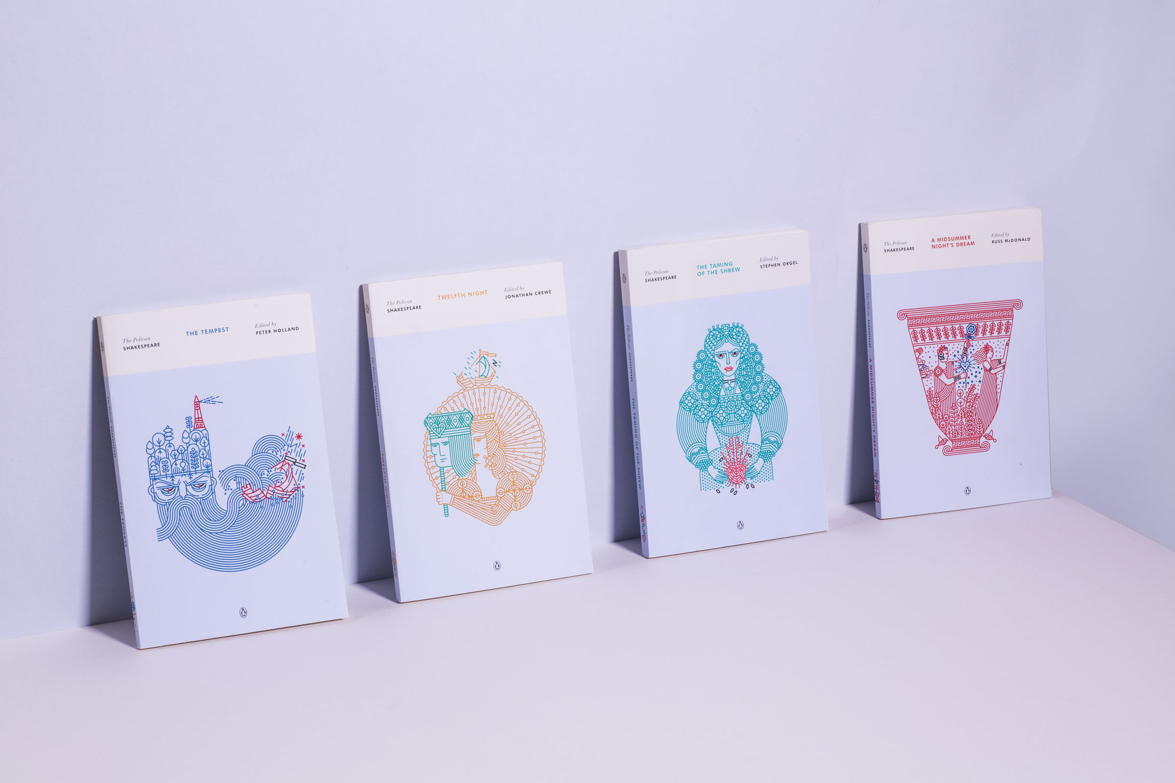
Our first example isn’t a single book cover, but a new series of designs for Shakespeare’s works illustrated by Manuja Waldia, in collaboration with Penguin Random House. One of the things that drew us to the project is that something as well-known as Shakespeare’s stories have been given such a fresh new identity. As Manuja tells us, “it’s hard to escape Shakespeare as his stories are so deeply embedded in popular culture, even if they are diluted to a point where you don’t realise it’s his stuff.”
Some of the more subtle hints to themes within the books keeps the whole series interesting and it’s nice to see some of Manuja’s personal interpretations, who carried out a lot of research prior to the project. Manuja gives us an insight into the positive collaboration with publishers Penguin and it’s clear this was a key contributor to the success of the project, which won a Gold Medal at the Society of Illustrators Annual Exhibition.
“I start by reading and researching the material. Sometimes the editorial team provides me with some initial ideas of their own, which are helpful insights about which directions would work better over others. I explore those along with a few ideas of my own as wordlists, or quick pencil thumbnails. From these I blow out 6-8 enlarged pencil sketches, the art team selects one for the front and another for the verso. I digitize them on Adobe Illustrator along with a couple of icons for the spine. Next comes final thoughts from the Penguin team, selecting a spine icon, and polishing up artwork. I get complete creative freedom, and the inputs from Penguin just push the work to the next level (thanks Paul Buckley!)”
When choosing our favourites from the (pretty large) series, we gravitated toward the comedies which are grouped by a consistent light blue background. Histories are grouped by maroon, and tragedies by black. When asked about her personal favourite covers in the series, Manuja replied “The Tempest, and The Merchant of Venice are my favourites as I took risks with both the concept and drawing, and the Penguin team were awesome enough to let me do it.”
Manuja’s approach to illustration is very personal and she has allowed her style to develop organically. When asked what her favourite book cover designed by any other artist, she answered “believe it or not, I don’t follow book cover design as it dilutes originality while I work… As most self taught artists, initially I was learning by copying a lot of both classical masters (Indian and Persian miniature paintings, Matisse, etc) and also contemporary successful illustrators (Jessica Hische, Lotta Nieminen). But thankfully overtime I had the good sense to stop consuming illustration for inspiration.”
She insists this is how her personal style was born, and advises others to embrace the kooks and imperfections in illustration. In the future she hopes to design cover artwork for authors from the Indian subcontinent, intersectional artist M.I.A, and feminist poet Nikita Gill.
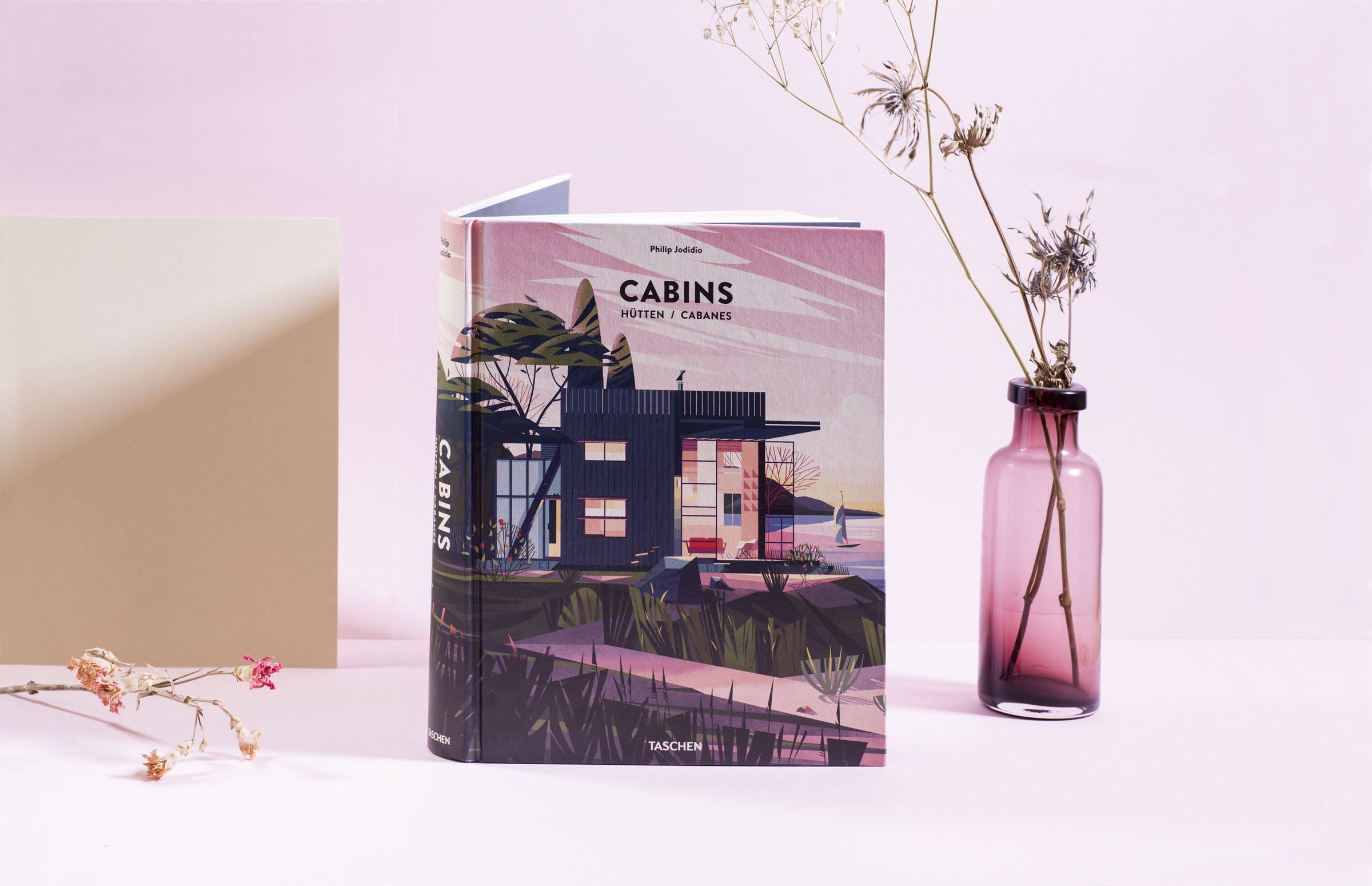
MARIE-LAURE CRUSCHI (AKA CRUSCHIFORM) – Cabins by Philip Jodidio, published by Taschen
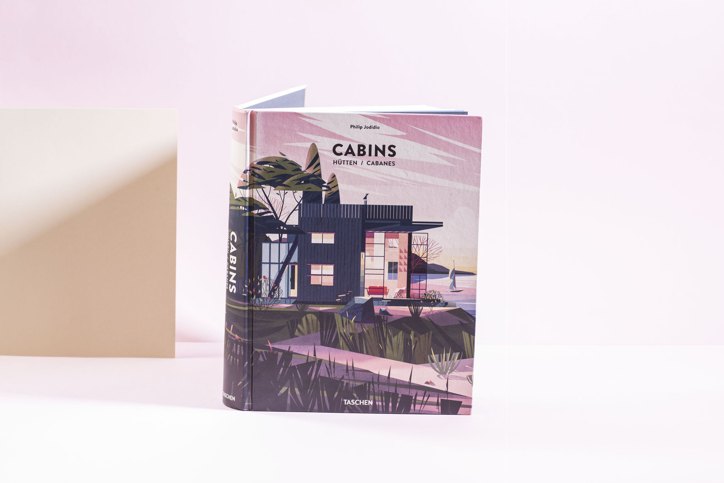
This is a beautiful hardback book published by Taschen that caught our eye when it was released in 2014. It’s no secret that we at Bookblock are fans of illustration, and French illustrator and art director Marie-Laure Cruschi’s artworks played no small part in our attraction to the book, as one of many beautiful illustrations of a cabin in the forest adorns the entire cover, uninterrupted (just like the landscape that many of the cabins inside fit so perfectly into).
Marie-Laure tells us she worked closely with Taschen for 6 months and over this time created over 60 illustrations, drawings and symbols, but it was an early trial drawing that Taschen immediately chose as the front cover image. We find this illustration particularly atmospheric which may be why it was such a clear choice for the cover. The size of the book, (measuring just over 24 by 30cm with almost 500 pages) and this full bleed illustration complement each other wonderfully, creating an impression of the cabins and their environments being tangible when you hold the book.
The feeling of being able to engage with the environments was also important for Marie-Laure, telling us that “each illustration represents a contemporary cabin celebrated in it’s nature’s jewel box. I wanted to create dreamlike pictures between realism and fantasy. So I tried to make a glorified vision, to inspire, to invite in a virtual journey, while trying to convey each cabin’s unique character, and remaining faithful to the original cabin architecture.”
In that sense, this project seems to strike a nice balance between her work in children’s books, cultural magazines and graphic design, as she combines the feeling of child-like fantasy with accurate and faithful representations of the cabins which is key to the nonfiction book.
She also recounts a positive collaboration between illustrator and publisher and how creative freedom paired with guidance produced a result and experience they both enjoyed, “once I had a good grasp of Taschen’s requests and their goals, I had a lot of freedom on creating the illustrations. It was like a Carte blanche. Of course I shared with them my work in progress, showing them my sketches, pictures references, colour moods… and it went very well.”
JENNIFER CARROW – Against Happiness by Eric G Wilson, published by Farrar, Straus and Giroux
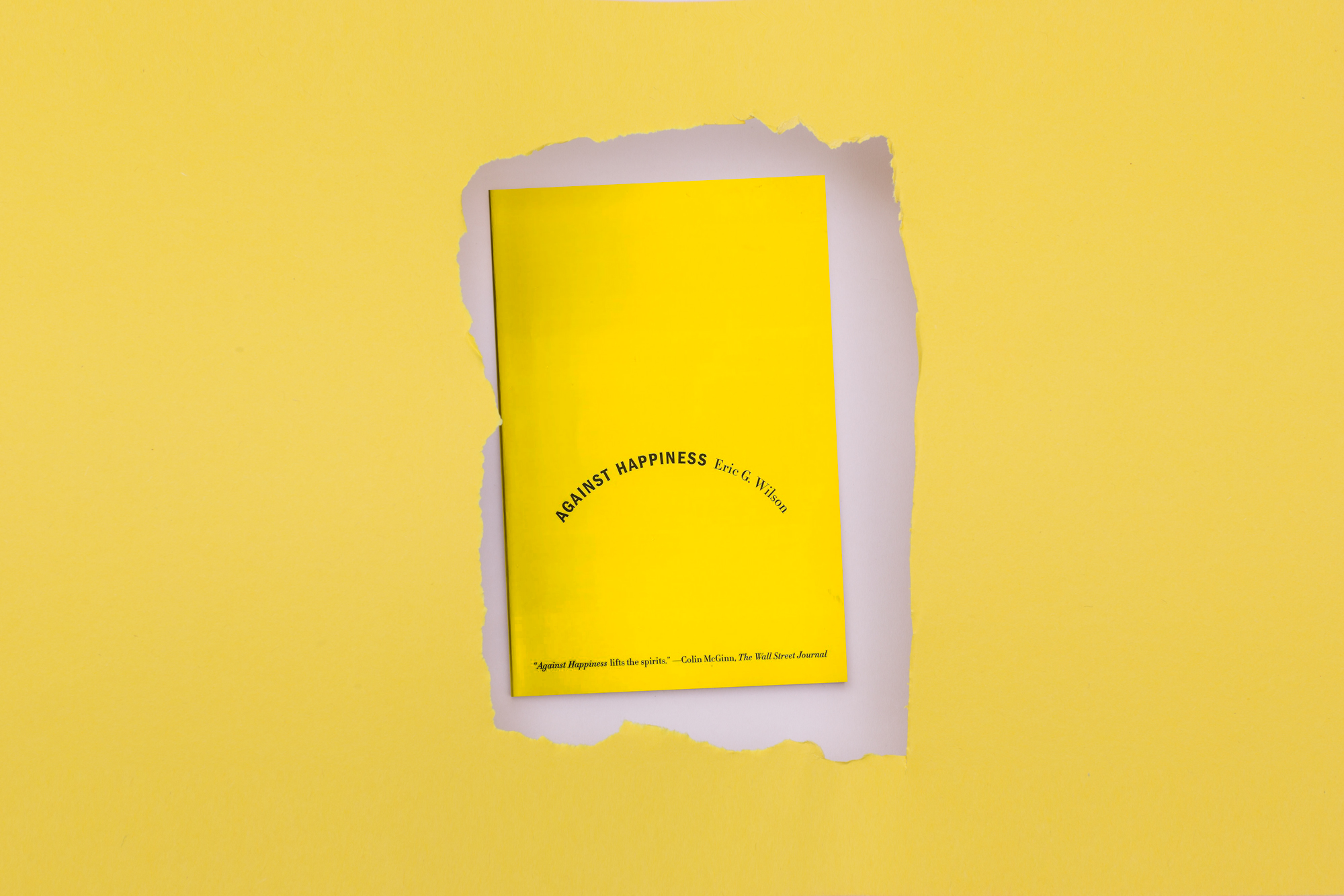
Our final choice is this cover designed by Jennifer Carrow, a prolific designer of book covers. Her portfolio spans various styles and genres, each of her many cover designs appearing unique to the book in question. Against Happiness is an example of her more minimal approaches to design, and we think this was the perfect direction to go in for this nonfiction book exploring the advantages of melancholia, particularly in relation to creativity and expression.
The book explores two polar opposite themes; happiness and sadness. Jennifer Carrow presents this brilliantly and simply; the bright yellow background instantly connotes themes of happiness, while the simple shape of a down turned smile, formed here by the typography, is equally as recognisable as a symbol of sadness.